The Colour that Defined a Decade
Uppercase Magazine #37: The CMYK Issue, January 2018
I grew up in a house that had a green refrigerator and stove.

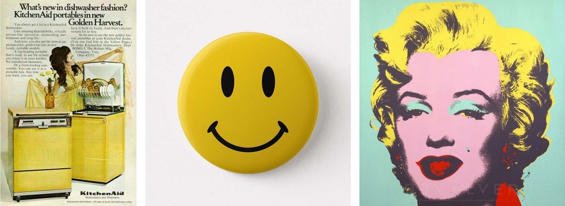
Or, as my design-savvy mother liked to call it – avocado. Back then kitchens in my neighbourhood of freshly-built houses sported everything from chocolate brown to harvest gold appliances. White had become commonplace while stainless steel was a finish limited to professional restaurants. But one family had a kitchen unlike all of the others. When you entered the room it greeted you like a sunny morning, full of energy and promise. Yellow – a canary yellow, filled the space. In this particular kitchen the refrigerator, stove, dishwasher, bread box and sink no longer played a supporting role – they were the stars. This was the 1960s and the use of bright colours was impacting everything. And yellow was leading the way.
The once shy colour had finally found its voice. Breaking away from its history of being relegated to pastel status, used in chintz patterns and on dining room walls, yellow commandeered popular culture with unapologetic gusto. The Beatles lived on a Yellow Submarine, Donovan was Mellow Yellow and summers were all about that Itsy Bitsy Teenie Weenie Yellow Polka Dot Bikini. Pop art shocked the art world with its silk-screened images and enlarged Ben-Day printing dots that appropriated everyday images of packaging, comics and celebrities. Yellow enhanced Andy Warhol’s Marilyn Monroe portraits and Roy Lichtenstein’s enlarged comic strip panels. It re-established itself as a primary colour and a major contributor to the fab four – CMYK. Braniff Airlines introduced yellow planes with flight attendants dressed in wild prints and yellow outfits by renowned Italian fashion designer Emilio Pucci. Three stylish sports coupes debuted during the sixties – GMC Camaro, Ford Mustang and Plymouth Barracuda. All available in yellow, each designed to win the hearts of young drivers. And let’s not forget the “Smiley Face” button. Launched in 1963, it quickly became a happy-go-lucky symbol of the decade. Over a period of ten years, yellow went from bashful to boastful, entering the seventies with a buoyant swagger.

In many respects, the sixties were a time of awakenings. Cultural and political issues fueled protest and debate on topics as varied as war, race, sex and the environment. It was a time to rebuff conventionalism and explore new horizons, not the least of which was outer space. In many instances social change proved to be difficult. Yet, regardless of the disruption, a desire for something better continued to flourish. As John Lennon said, “The thing the sixties did was to show us the possibilities and the responsibilities that we all had. It wasn’t the answer. It just gave us a glimpse of the possibility.”
The use of colour exploded during the 1960s, becoming another means by which a generation could express themselves. They desperately wanted to be heard and to be seen. They were not interested in being restrained and muted. And, in the end, it was the brightest colour of them all – yellow, a ray of light, a time-honoured symbol of hope and enlightenment, that came to define the decade.